Aena, the Spanish airport operator, and Enaire, the public company responsible for air navigation, have changed logos.The new Aena’s logo is not really a new corporate image. It is actually a redesign from the usual logo made by Javier Mariscal. The blue colour, which alludes to air, disappears in the brand: any matters related to the air space management have been kept by Enaire. Mariscal introduced a more lighthearted typography and left green as the only colour, together with black for the association to allude to the environment.The new logo introduction is being made little by little. Actually you may have noticed…
Tag Archives: ATC
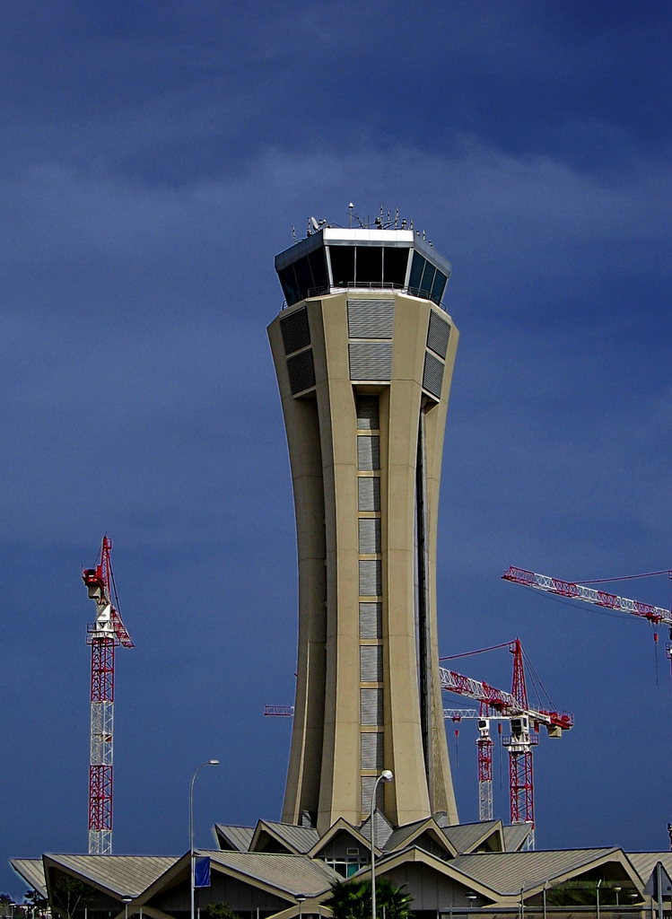
ENAIRE: Catalá replaces Vargas Regulations
Last Tuesday, the Spanish Official Gazette (BOE) published the José Manuel Vargas cessation as chairman of the public company ENAIRE.The Royal Decree published in BOE on the 5th of July considered, with Article 18, two name changes: On the one hand, the change from Aena Aeropuertos, S.A. to Aena, S.A. This is the airport owner, the part of Aena which is being privatised. On the other hand, Aeropuertos Españoles y Navegación Aérea – AENA – becomes ENAIRE.As we had already explained, the part of Aena which used to be responsible for air navigation is, therefore, from now on ENAIRE. It will continue to be a public company…
Aena tariff freeze until 2025 Charges,Regulations
- – 4 July, 2014
 Comments Off on Aena tariff freeze until 2025
 Aena, ATC, DORA, ENAIRE, Investments, Madrid, Privatisation

Aena tariff freeze: The ministry of Development—Fomento—is ready for the Aena tariff freeze in the Spanish airports until 2025.The Royal Decree draft of the Document for Airport Regulation (DORA) takes into consideration the Aena tariff freeze until 2025. This is expected just after the confirmation of the privatisation by 49% of Aena Aeropuertos.The target is to bring more traffic to the Spanish airports. Hence, the Aena tariff freeze will be subject to conditions such as “possible regulatory changes or unforeseen occurrences”.Thus, the draft fixes the Aena tariff freeze until 2025 provided that the investments in the net are not over 450 million Euros…
New satellite navigation system available for landings at the Spanish airports Airports
Last week Aena announced a new satellite navigation system is available for landings at the Spanish airports through a press release which translation follows: The GBAS system is already available at one Spanish airport Aena is worldwide leader in starting new technologies and introduces operations based on satellite navigation 05 May 2014 As from today, Aena offer the possibility of landing at a Spanish airport using a modern satellite navigation system which suppose a significant step with regard to safety, cost savings and effectiveness for the air transport users. This is the satellite navigation system named GBAS (Ground Based Augmentation…
Flight Consulting interview by ATC supervisor FC Tools
We are proud to share the Flight Consulting interview by Mr. Cayetano de Martí – ATC supervisor from the Canary Island ACC – for USCA Magazine. Please find below our free translation: The aviation Industry is not just aircrafts and airlines. There are hundreds of activities around. Without them there would not be air transport. This is the case of Flight Consulting, a small Spanish company operating since more than twenty years ago which provides advice about all the problems behind each operation. We think it is dramatic that a flight has to be cancelled because there is no way…
Air Navigation charges 2014 Charges,Regulations
- – 6 February, 2014
- Comments Off on Air Navigation charges 2014
- ATC, Eurocontrol

Air Navigation charges: Air Navigation charges for the Spanish airspace are not suffering any changes in 2014, as we already anticipated here,This has been confirmed today in the Official Gazette B.O.E., where you can find the new charges for the rest of participant countries in Eurocontrol. Source: B.O.E.
Approach charges to be billed by Eurocontrol Charges
- – 2 January, 2014
- Comments Off on Approach charges to be billed by Eurocontrol
- Aena, approach, ATC, Eurocontrol
Eurocontol has notified through an Information Circular that, with effect 1st January 2014, the Air Navigation Terminal charges are billed and collected by them on behalf of AENA.Furthermore AENA Group informs to all users affected, that charges related to December operations shall be paid to Aena as usual.Charges related to flights operated in any AENA airport from 1st January 2014 onwards will be billed and collected by Eurocontrol as it is done for the en-route charge. Source: Eurocontrol
The Government is now open to privatise Aena by 60% Airports
- – 21 October, 2013
- Comments Off on The Government is now open to privatise Aena by 60%
- Aena, ATC, Investments, Privatisation
In spite of the fact that Aena intended to keep 51% of the company after its partial privatisation, Hispanidad informed on Friday that this approach would have been refused by the market and hence the Ministry is forced to lose control over AenaFor their part, Aena would not accept the proposal made by some companies like Abertis for selling the Barcelona and Madrid airport management: “Territorial solidarity cannot be broken, the safety of the net must be kept”.For these reasons, the Ministry’s current plan is to privatise Aena by 60% which, according to the Aena’s calculations is estimated at 10,800 million Euros. The…
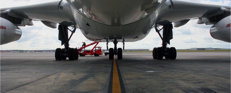
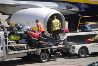
Madrid testing the CDM to optimise air traffic Handling

Madrid testing the CDM: Yesterday, Madrid airport started the first operational tests of the A-CDM—Airport Collaborative Decision Making—within this project, promoted by Eurocontrol, which is intended to optimise the air traffic management while punctuality and operational efficiency improve at this airport.Hence, the first DPI message—Departure Planning Information—was sent yesterday from the CDM platform to Eurocontrol. This information allows Eurocontrol to know the situation of each flight in real time, letting them optimise the capacity and, if necessary, apply regulations based on up-to-date information.Airlines and handling agents will have data as much as possible in advance, the planning will be better…
En-route charge could be increased in 2014 Airports,Charges
- – 16 April, 2013
- Comments Off on En-route charge could be increased in 2014
- ATC, Eurocontrol, Madrid
The General Manager of Air Navigation, Mr. Ignacio González, has announced that the en-route charge could be increased in 2014.In a meeting held with the media, Ignacio Gonzalez explained that the en-route charge in Spain could increase in 2014, after a couple of years of being frozen. According to Gonzalez, it is too early to confirm if this will happen. A lot of work still has to be done and many variables need to be analyzed before taking this decision. It will depend on whether the traffic is growing or not, and whether Air Navigation can continue to reduce the…